With the increasing use of smartphones and mobile devices accessing the Internet, having a website that is optimised to display properly across all these devices is a necessity.
By ensuring your website is mobile friendly it will not only improve the user experience (UX) but will also improve your search engine rankings (SEO) and increase the time your customers and clients spend on your website (bounce rates).
In this article, we will cover what mobile friendly design is and how it has a big influence on the success of your website.
Table of Contents
What is mobile friendly design?
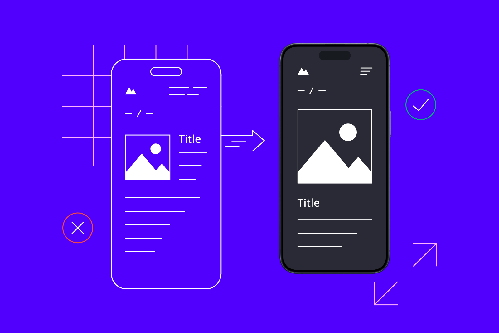
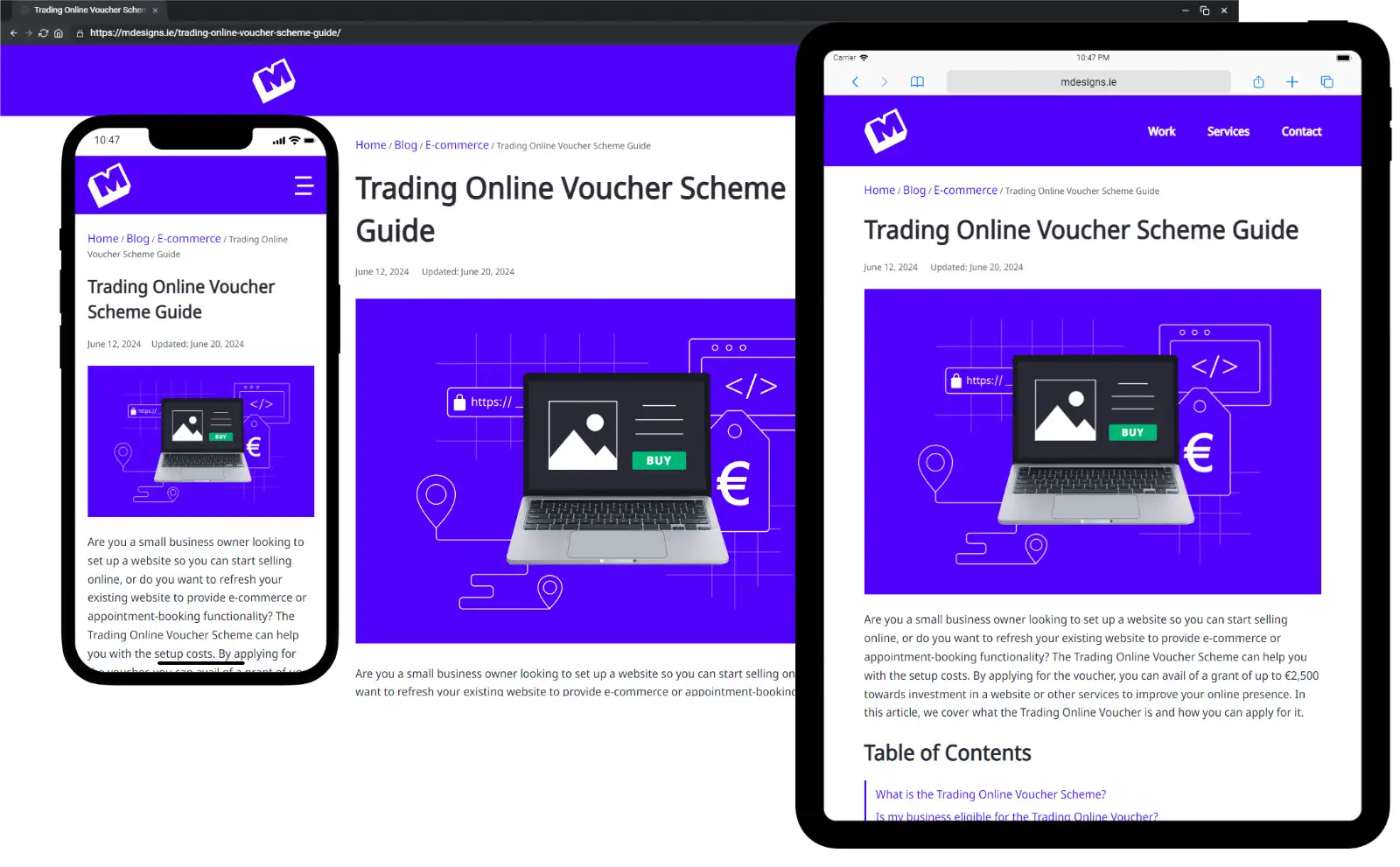
Mobile friendly design means designing elements of a website specifically for mobile phones and other small screen devices, such as tablets, to ensure users have the best viewing and interaction experience.
This design approach uses responsive design techniques that will automatically adjust the layout of the website to suit both desktop screens and the mobile device it is being displayed on.
The key considerations of mobile friendly website design are:
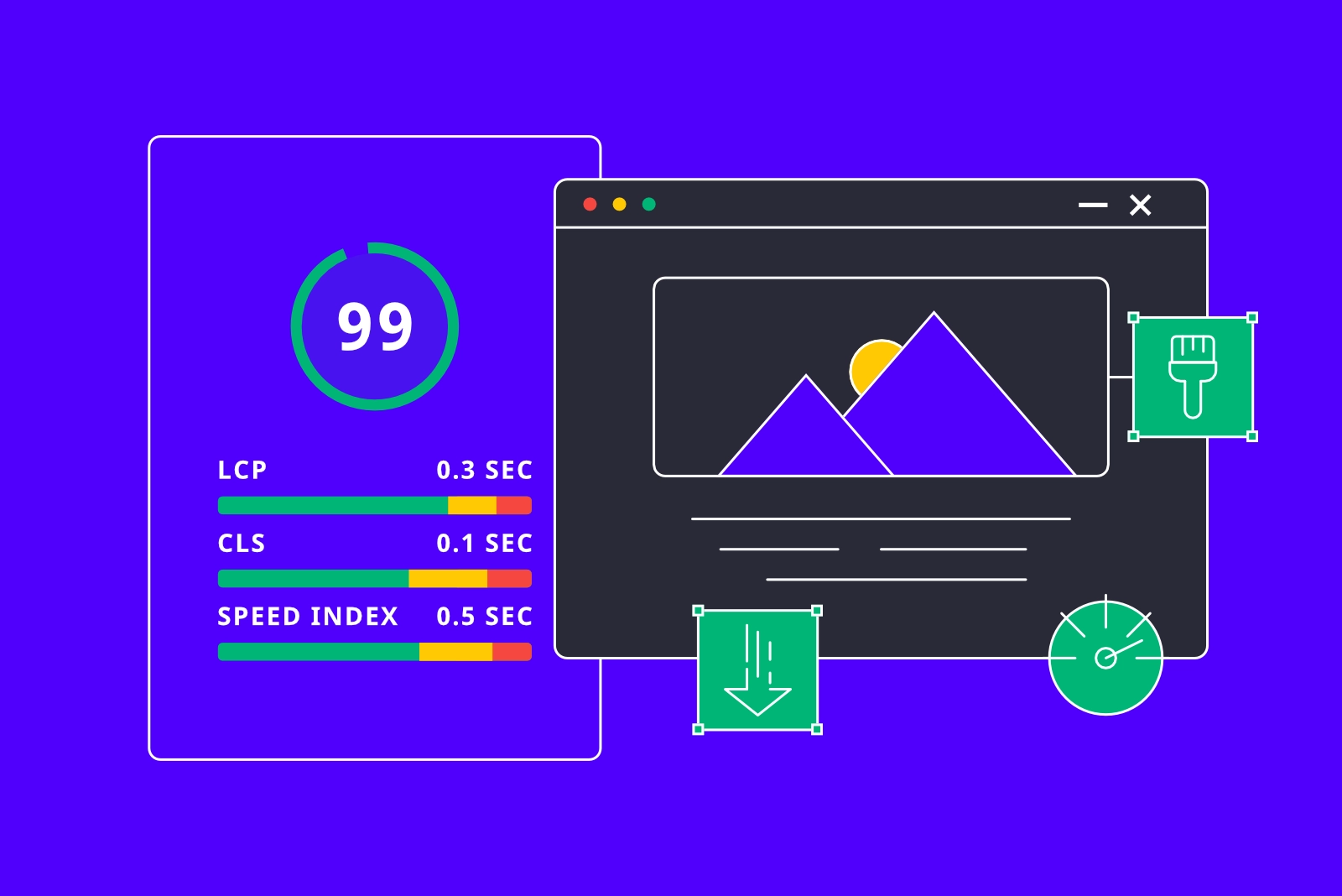
- Fast page loading times.
- Images that are sized appropriately for mobile.
- Easy to use navigation and buttons with big tap targets.
- Readable text on small screens without the need to zoom.
- Inputs and other touch points are designed for mobile users.
- Compressing image sizes and reducing bandwidth heavy elements.
Since a lot of shoppers like to research the products and services they buy on mobile and then purchase on desktop, following these principles will ensure your users have a seamless experience on whatever device they are using. This will in turn enhance user satisfaction, reduce bounce rates (the percentage of users who back out of a website after only viewing one page), and improve your search engine rankings.
Why having a mobile friendly website is important?
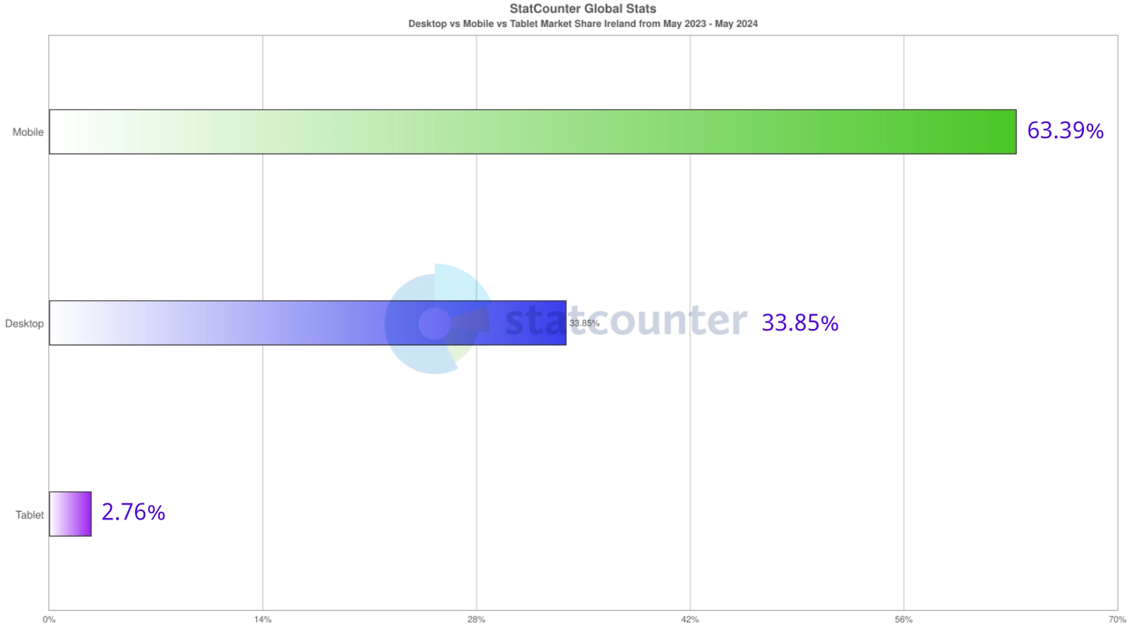
The number of mobile Internet users in Ireland has been growing steadily year over year. According to recent statistics, smartphones account for 63% of Internet accessible devices [1].
A recent Retail Excellence Ireland report [2] found that only 66% of their members had a mobile friendly website.
Since Google now prioritises the mobile version of a website [3] to determine its page score, failure to adapt will result in less visibility in searches and the loss of potential customers.
Mobile friendly design statistics
- Google now prioritises mobile friendly websites in search results. [3]
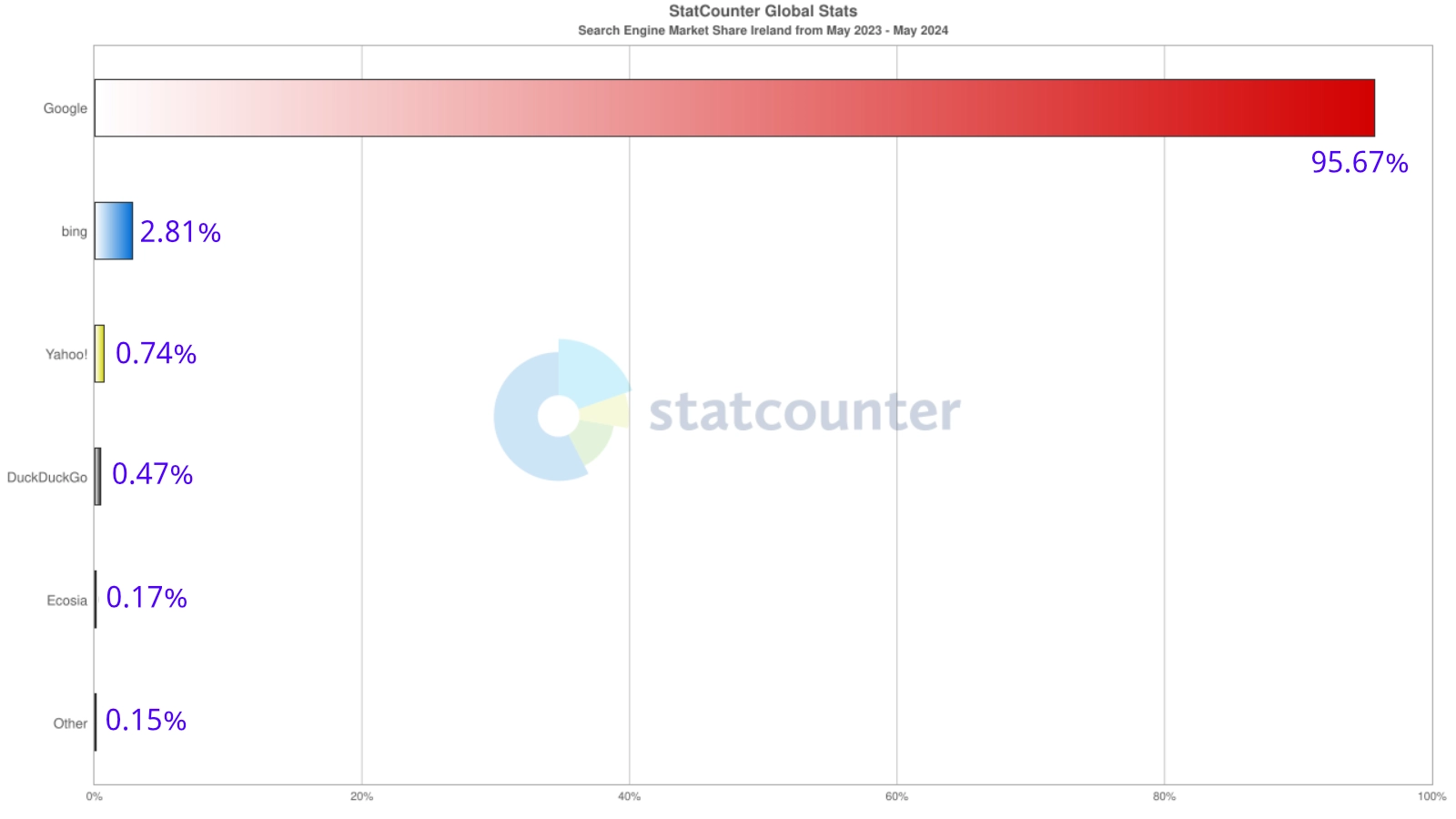
- Google was the most viewed website in Ireland in 2023. [4]
- 95% of website traffic comes from Google. [5]
- 75% of users prefer a mobile friendly site. [6]
- 74% of people say they’re more likely to return to a mobile friendly website. [6]
- 67% say when they visit a mobile friendly website, they are more likely to purchase a product. [6]
- 50% said even if they like a business, they are less likely to buy if the website is not mobile friendly. [6]
- 48% say that a non mobile friendly website made them think the business didn’t care about them. [6]
This research confirms that smartphone users prefer mobile friendly websites. This highlights how people’s attitudes about businesses are shaped by how they perceive their mobile experience. A quality user experience is now essential to boost sales and building a stronger brand.
By leveraging mobile design principles, you will have better outcomes in terms of conversions, SEO, and positive customer sentiment.
How do I check if my website is mobile friendly?
The easiest way would be to check it yourself on a mobile phone or tablet. Then you can see if it meets the criteria discussed in this article, such as:
- Does the website menu have a hamburger icon, or is the menu text based?
- What size is the text? Is it too small or too big?
- Is the text easy to read? Are the headings and paragraphs spaced out appropriately?
- Do the images display correctly? Are they too small or too big, or are they in two columns?
- Can you pinch to zoom in on the page?
- Can you easily tap all the buttons and links, or do you have to tap repeatedly?
If your website fails on a few of these, then unfortunately, you don’t have a mobile friendly website.
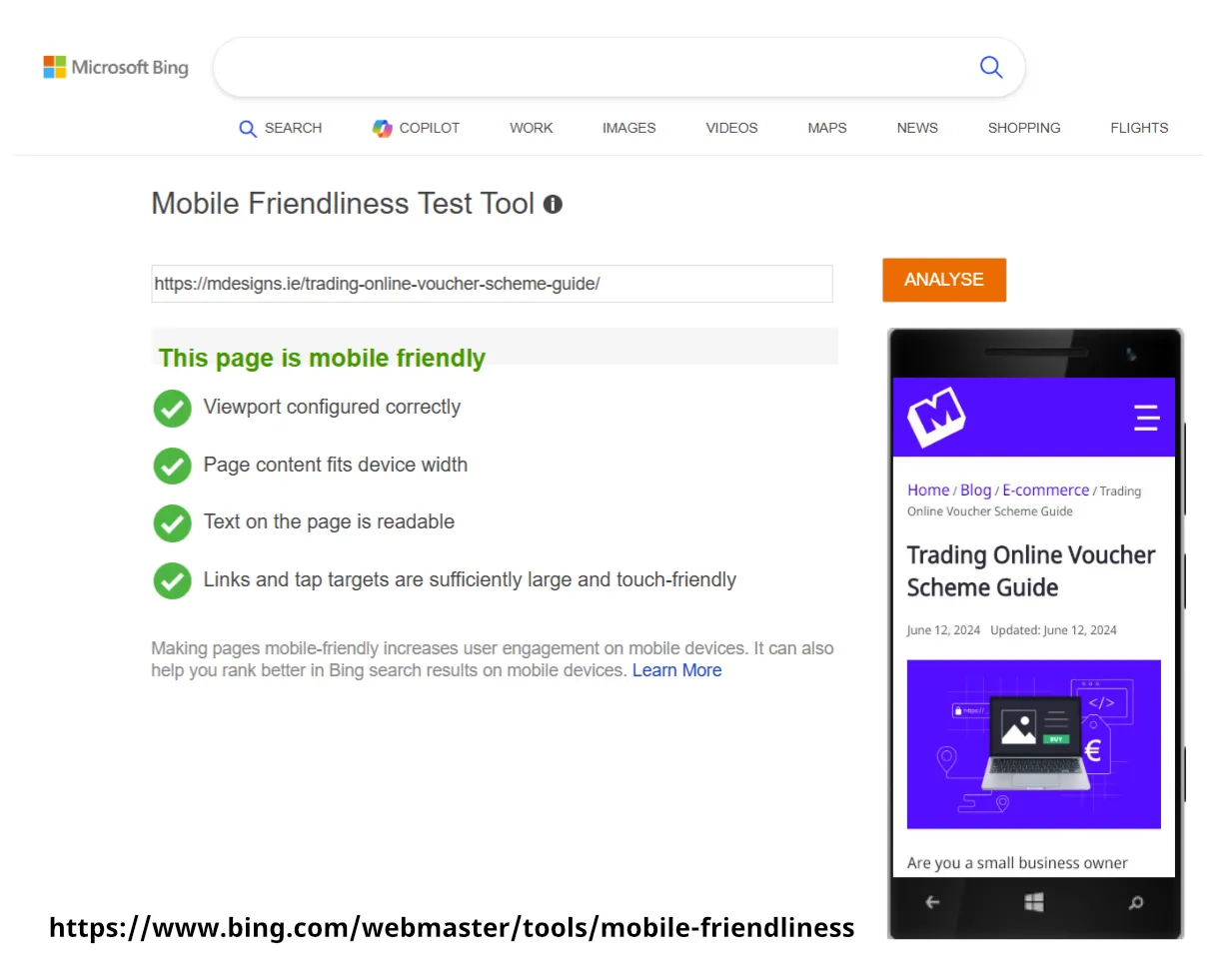
You can also use online tools such as Bing’s Mobile Friendliness Tool [7] to check if your website is mobile friendly. If you pass, you still might have to implement other enhancements to improve your user’s experience.
Can I make my website more mobile friendly?
Although it is best to have designed your website with mobile friendliness in mind, you can still take steps to improve how your website displays on mobile devices.
- Use a new theme: If your website is several years old and you use WordPress as your content management system, then you could investigate using a different theme. If you have an old theme, then it may not be compatible with modern website design principles. Make sure to backup your website before making any drastic changes.
- Compress images: Look at all the images in your media library and take note of their size. Compress any images that are over 1 MB size. An ideal size for a website page on mobile is actually 1 MB total. This will allow for fast loading on mobile phones and reduce lag.
- Limit popups: Try to limit popups, such as newsletter signups, to one specific page. Popups, while good for conversions, are very intensive on mobile phones, especially older ones. Try incorporating your call to action in your website footer instead. This will improve your user experience (UX) by making it less annoying for your repeat viewers.
- Make forms easy to use for mobile users: Make sure your forms and other touch points display in just one column. An ideal form can be filled in on just one screen, so the user doesn’t have to scroll. Forms that are too long can be awkward to fill out on small smartphone screens.
- Menus: Since menus are used to navigate your website, they are crucial to get right. As mentioned previously, getting a new theme may be the answer to having a more mobile friendly website. If, for some reason, you can’t update, then you should investigate getting an upgrade. In the meantime, if you don’t see a hamburger icon on mobile, try to limit your main menu to 2-3 important links. Depending on your menu item names, this might not wrap to two lines. Store links to social media and non-essential items in your footer (bottom of each page).


These are just some of the ways you can improve the user experience for visitors on your website.
Future-proof your website and start with mobile friendly design
Incorporating mobile friendly website design principles on your website is essential. With 63%+ traffic for most websites coming from mobile phone users, prioritising the mobile user experience will increase the time users spend browsing your website.
Since Google and other search engines now use the mobile version of your website for ranking and indexing, not being mobile friendly is harming your SEO by lowering your position in search results.
If you are considering a website refresh, contact us to learn how we can optimise your existing or a new website for mobile so you can increase engagement and conversions for your business.
Mobile friendly design FAQs
What is mobile friendly website design?
Mobile friendly design means ensuring a website is easily accessible on mobile devices like smartphones and tablets, so users have the best viewing and interaction experience.
Why is it important that my website is mobile friendly?
63% of internet traffic comes from mobile devices in Ireland. By catering to these users, you will boost your SEO rankings, and overall increase conversions and engagement.
What are bounce rates?
Bounce rate is the percentage of users who leave your website after only viewing one page.
Will a mobile friendly website get more traffic?
By improving the user experience on your website on small screen devices, users are more likely to visit more pages.
What is user experience UX?
UX refers to the experience a user has when interacting with your website. UX encompasses aspects such as accessibility, functionality, performance, and aesthetics.
What is mobile-first indexing?
Google now grades the mobile version of a website to determine your rank and indexing in search results.
How do I check if my current website is mobile friendly?
You can check yourself on mobile devices or use tools such as the Bing Mobile Friendliness Tool.
Can I make my website mobile friendly?
You can always improve your existing website by optimising the layout and navigation and making your page sizes smaller by compressing images.
Sources
- Statcounter
- Retail excellence Ireland
- Similar Web
- Statcounter
- Think with Google
- Bing Mobile Friendliness Tool